Featured cases
- ABM Industries 2012
- AkzoNobel 2008
- Alcatel-Lucent 2006
- Alliance Boots 2006
- Apple 2007
- Aramark 1994
- ArcelorMittal 2007
- Assurant 2004
- Bausch & Lomb 2004
- BDO International 2010
- Belgacom 2003
- Boise Cascade 2002
- BP 2000
- Broadview Security 2009
- Brocade 2007
- CA 2005
- Cardinal Health 2003
- CEC Bank 2008
- Chemtura 2005
- Cisco Systems 2006
- Cision 2007
- Computer Associates 2001
- Covidien 2007
- Credit Suisse 2006
- CSC 2008
- Daimler 2007
- Delta Air Lines 2007
- Devon Energy 2007
- DSM 2011
- Eastman Kodak 2006
- EDF 2005
- Experian 2007
- Federal Express 1994
- FedEx Corporation 2000
- FICO 2009
- Fiserv Inc. 2009
- Fortis 1998
- Fortis 2006
- Fortis 1991
- Genworth 2004
- Gillette 1993
- Grant Thornton 2008
- Harcourt General 1993
- Harlan Laboratories 2008
- Hyperion 2006
- Ingersoll Rand 2005
- Intel 2006
- Invista 2003
- Johnson Controls 2007
- Kemper 2011
- Lineage Logistics 2012
- LM Wind Power 2010
- Lucent Technologies 1996
- Marathon Oil Corporation 2011
- Marsh & McLennan Companies 2011
- Massachusetts Institute of Technology (MIT) 2003
- McGladrey 2010
- Meredith Corporation 2009
- MFS Investment Management 2012
- Morgan Stanley 2006
- Nielsen 2007
- Nokia Siemens Networks 2007
- Novartis 1997
- NXP Semiconductors 2006
- Outward Bound USA 2005
- Polycom 2012
- Princeton University Press 2007
- Reliance ADAG 2006
- Rockwell Collins 2006
- Samsung 1993
- Sensata Technologies 2006
- Shipley Energy 2011
- Sistema Telecom 2006
- Smith & Nephew 2003
- Sprint (Sprint Nextel) 2005
- Starbucks 2011
- Tenneco 1995
- Texenergo 2011
- The Joint Commission 2007
- The Paley Center for Media 2007
- The Phoenix Companies 2006
- Thomson Reuters 2008
- Tyco Electronics 2007
- Umicore 2001
- Unilever 2004
- Unum Group 2007
- Vale 2007
- Vantiv 2011
- Velfina 2004
- Wolters Kluwer 2005
- Wyeth Pharmaceuticals 2002
- Xerox 2008
Case: Starbucks 2011
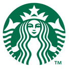 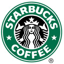 When Starbucks rebrands, seventeen thousand stores (in 50 countries) get a face lift. Thats a very big deal. It changes the way the world looks. But its costly. Why bother? Steve Barrett, who heads Starbucks 100-strong design studio, put it in perspective. While business in 2010 picked up nicely, we have been through a painful period, bottoming in 2009 a combination of self-inflicted problems, the economic downturn, and better-focused competition from both independent coffee houses and chains like McDonalds. CEO Howard Schultz and the leadership team have countered with a variety of successful moves (including Frappuccino and VIA) but the biggest is to get back to our roots, to re-charge the power of connections between our partners [read employees] and our customers. We think a rebranding can be a helpful signal to partners [30% weighting] and customers alike [30%] the reality of a new, emerging Starbucks. Barrett and his team closely studied design-driven renewals by other "visible and trusted" brands like Apple and Nike, and made two decisions. The first was to strip away the "verbiage" that cluttered the brand's symbol, leaving only its most distinctive visual essence, the siren. (Because the separate STARBUCKS wordmark remains, on storefronts, as the primary identifier, "Starbucks" in the symbol too is redundant. And "Coffee," while important, is increasingly limiting [its removal gets a 20% weighting].) The second decision was to significantly extend the brand's visual presence by creating "an expanded set of visual materials" to work with. For this, Barrett turned to Lippincott's design team, directed by Connie Birdsall. Lippincott's key contributions, then, were:
Increased global visual consistency, in this case primarily through a stronger set of secondary visual elements (rather than from the simpler symbol aalone), accounts for a 20% weighting. The visual rebranding has been guided by, and teams with, a fresh articulation of corporate cultural attributes, expressed as... "Genuine, Thoughtful, Optimistic, Expressive, Engaging," directly targeted at employee behaviour modification. The 5 January 2011 "soft launch" was an employee-focused public preview, building toward higher-visibility advertising and in-store events in March, keyed to Starbuck's 40th anniversary. CREDITS Internal, + Lippincott CASE INFO Submitted by: Tony Spaeth, 13/01/2011 |
MATRIX DATA
DRIVERS | TOOLS | ||
| Strategic driver: 80% | |||
|
Broaden scope/scale/visibility Remove limiting category association | 20% | x | Identifier tactics: Logo change: Symbol-dominant |
| x | Change event : High visibility: Campaign | ||
|
Change internal culture Enhance pride & confidence | 30% | x | Identifier tactics: Logo change: Symbol-dominant |
| x | Identity system elements: Visual system: Graphic devices | ||
| x | Change event : Medium visibility: Launch event | ||
| x | Change event : High visibility: Campaign | ||
| x | Situation facts: Corporate level facts: Employee behaviour | ||
|
Change expressed personality Renew/refresh public image | 30% | x | Identifier tactics: Logo change: Symbol-dominant |
| x | Identity system elements: Visual system: Graphic devices | ||
| x | Change event : High visibility: Campaign | ||
| Functional driver: 20% | |||
|
Design weakness Increase visual strength/quality | 20% | x | Identifier tactics: Logo change: Symbol-dominant |
| x | Identity system elements: Visual system: Graphic devices | ||